Angela Clemente

Case Study
Nudge: Curbing Emotional Spending
Design a mobile application that helps users reduce impulsive, emotionally-driven spending by building self-awareness of emotional triggers and providing gentle, well-timed interventions.
Timeline
5 weeks
Role
Product Designer
Team
3 Product Designers
CLient
MHCI+D assignment
Final Product
Nudge V2 is a mobile application that helps users reduce emotionally-driven impulse spending through self-reported EMA check-ins, contextual nudges at the moment of purchase, and positive reinforcement through streaks, savings milestones, and a skipped purchases catalog.
Spending Snapshot
Personalized insight cards delivered monthly, surfacing patterns in a user's own data with human framing
Daily Spend Reflection
How a user reflects on their recent purchases, marking how they felt at the time of purchase
What I Did + My Impact
Situation
The Market Treats Spending as Math. It’s Actually Emotional.
Impulsive spending driven by emotional triggers is widespread among young adults navigating social media and frictionless payment systems.
Existing budgeting tools track what people spend, but none address why they spend — and most young adults aren't using them anyway.
"None, [I don't use any budgeting tools], I avoid looking at my bank account."
-Survey respondent
39%
of Americans
58%
of Gen Z
52%
of Millennials
Identify as Emotional Spenders
Credit Karma / Qualtrics, 2023
Task
Design a mobile app that reduces emotionally-driven impulse spending through self-awareness and gentle, well-timed interventions — not restriction or shame. That framing was structural. It ruled out punitive friction and guilt-based alerts from the start.
Action
Understanding Problem Space & Ideation

desk research helped us define direction
45% of emotional shoppers feel buyer's remorse

n=49
56% of respondents said emotions strongly influence their purchases

5 in-depth interviews
2 main triggers: emotions and FOMO


r/shoppingaddiction, r/nobuy, r/personalfinance
repetitive language around guilt & the "high" of moment of purchase
“I made impulsive purchases [...], but now I'm looking back with regret and I just feel so [bad] about myself... I can't stop beating myself up for spending too much on small purchases."
r/ADHDwomen, 2024

Initial concept sketches

We explored the intersection of emotional state, social media exposure, and purchasing behavior
V1 Failed: Biometrics Destroyed User Trust.
Our first prototype used wearable biometric data to detect emotional spikes and trigger automatic interventions. The concept was research-backed, and users responded well to the just-in-time intervention model. But testing with 4 participants surfaced three distinct problems with the data layer:
Transparency
V1 asked for biometric access without earning that right first
Individual Variance
Could biometric averages accurately reflect their personal emotional state
Trust Sequencing
Layering biometric surveillance on top of high-anxiety subject of money
The core concept was validated. The data model was a dealbreaker.
I arrived at my own diagnosis: if the system could only label an emotional state as 'stressed' or 'happy,' the output wasn't specific enough to justify that level of data collection. That misalignment was the argument I brought to the team — and it's what convinced us to abandon biometrics entirely.
The Pivot: Trading Perfect Data for User Agency.
As a team, we surfaced Ecological Momentary Assessment (EMA), a clinical methodology using brief, self-reported check-ins.
The key adaptation was shifting from emotion-specific questions ("How are you feeling?") to behavioral proxies ("What's your energy level?"), transparent by design, low-stakes enough to ask before trust is established, and grounded in individual self-report rather than biometric averages.
I championed user agency over data precision, arguing we should sacrifice accuracy for consent. That argument is what moved the team to redesign the product architecture entirely around self-reported input.

Redesigning for Trust & Positive Reinforcement
The redesign had two jobs: demonstrate what Nudge does with emotional data before asking for more of it, and make the experience feel supportive rather than clinical.
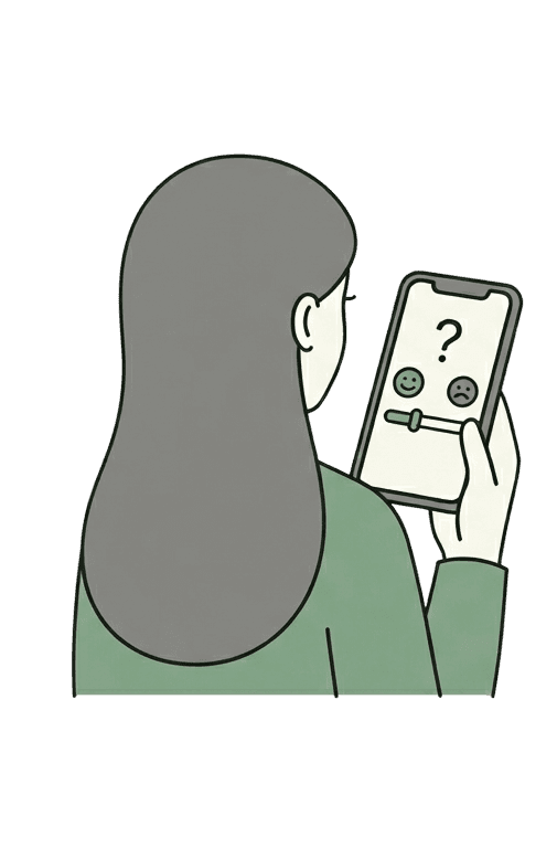
As a team, we designed the daily check-in flow around a single constraint: fast enough that users wouldn't skip it, and meaningful enough that the data would actually be useful. One behavioral question. Three answer options. No more than a few seconds to complete.

App reads wearable data continuously. Users don't control what's collected or when.

User initiates every check-in. They see exactly what's shared and choose when to respond.
How it works


Result
Nudge V2 validated that emotion-aware spending intervention works, but only when the product earns trust before it asks for data. Three design principles emerged from testing:
Trust before data
EMA check-ins succeeded where biometrics failed because users chose to participate, not be passively monitored
Celebrate, don't punish
Positive reinforcement drove engagement. Users responded to proof of their own self-control, not reminders of their failures
Just-in-time interventions
The nudge at the moment of a potential impulse purchase was cited as the most valuable feature. Users wanted help in the moment
Daily Spend Reflection
The daily spend reflection put interpretation in the user’s hands: they reviewed their own spending and emotional context, so the app felt like a tool they controlled rather than a system judging them.
Skipped Purchases
Every avoided impulse logged, visible over time — proof that saying no added up to something.
Onboarding
Onboarding built trust by connecting finances through Plaid, a service users already recognize, and by showing the kinds of spending Nudge focuses on before asking for deeper engagement.
Money Milestones
A single behavioral question — "What's your energy level today?" — that takes seconds to complete.
Check In
A single behavioral question — "What's your energy level today?" — that takes seconds to complete.
Spending Snapshot
Monthly insight cards delivered, surfacing patterns in a user's data with recognizable and low-pressure framing.
Reflection
What I Learned
This project reinforced a core behavioral design principle: sustainable behavior change requires encouragement and self-awareness, not restriction or shame.
Next Steps
If this project continued, I would focus on three areas:
Monetization without contradiction
Explore a low-cost subscription model and seconday market of parents managing children's spending
Longitudinal validaiton
30-day diary study with real financial data to test efficacy
In-the-moment support
"Hand-holding" flows that guide users through the moment after the intervention